Calling our design approach “anti-survivorship bias,” within a 48-hour window, my teammates and I develop and pitch a design solution aimed at to improve the experience of thousands of students enrolled in CourseKata, a platform for online statistics education. Using R to analyze data from over 2 millions data rows, collected from 48 college-level introductory statistics and data science classes taught in 11 different institutions in the U.S, our analysis revealed how different types of questions in each module correlated with student retention. Based on these insights, we provided recommendations on how to frame questions more effectively and optimize course content to keep students engaged and prevent dropouts.
Role:
Data Scientist, UX Researcher
Skills applied:
Figma, Canva (prototyping), R, Data Visualization
Problem Statement:
On average, 20% of students drop out before they even reach the middle checkpoint. Why are students getting left behind? How can we enhance our site to ensure that students remain engaged with our course?
Visual graph of the number of students who drop out per chapter: On average, students continue to drop out every chapter.
We used the iconic plane survivorship graph to illustrate how this finding relates to one of our key principles in designing this project. As researchers analysed surviving World War 2 planes after combat and where they were damaged, such as the wings, their first instinct would be to heavily reinforce those areas. However, survivorship bias proposes that by only looking at the survivors, we miss the data from those who were left behind. Thus, the lost planes who were hit in critical areas, such as the engine, were not able to be researched.
Applying this concept, instead of looking at students who successfully completed the course, we put emphasis on students who drop off early, or are 'left behind'. As we want every student to succeed, this became our main motivation and leading question:
Defining success in a student as "Learning for the sake of learning and commitment", instead of numerical data like grades, why do students get left behind - or drop out, and how we can improve CourseKata’s?
Research Process:
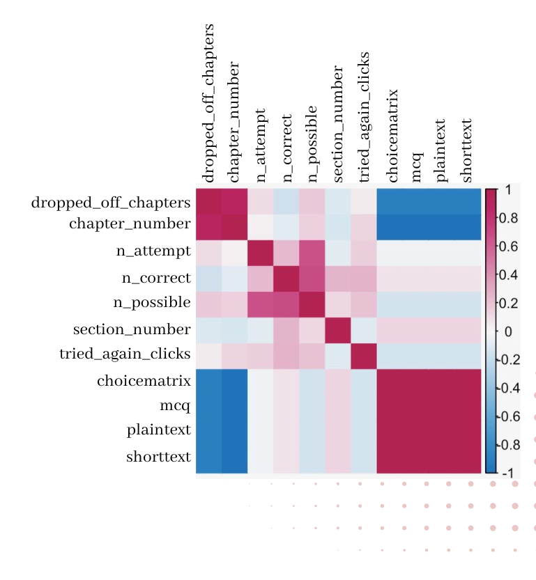
Using a correlation matrix, we were able to identify extreme negative correlation between the number of students dropping off per chapter of the statistics course and certain question types. Specifically, plain text questions had the most negative relationship. Other variables, such as number of attempts and tried again clicks have very little correlation.
With these leads, we ran a linear regression model on some of the question types including choice matrixes, multiple choice questions, and plain text, and found that the less questions being asked, the more likely students will stay until the end of the course.
We tested the significance of our results by extracting values from the lm() function in R. We examined the relationship between drop-off chapters and the number of multiple-choice questions, obtaining a p-value very close to 0, which indicates that our findings are statistically significant.
In fact, open-ended questions are associated with higher cognitive burden and stress. The more students are asked to write, the less they will stay committed in the course.
Design Recommedations:
Altering the site to have fewer, more intentional plain text questions
While plain text questions serve the purpose of reviewing material and assessing knowledge, having too much can overwhelm users and deter progression. Therefore, we incorporated fewer plain text questions actively spaced out throughout the content.
Providing notifications after a long idle time.
Prompt users to re-engage if they've been inactive for an extended period. Some users may simply require a gentle reminder to refocus and avoid distractions.
Creating an opt-in widget after disengagement to survey the design of the site.
Although the survey at the beginning of each chapter allows students to evaluate their confidence,it doesn’t offer specific insight into how the course content contributes to their learning. We created a survey asking about factors such as the difficulty of the content, readability issues, or the complexity of questions. This approach aims to gather insights focused on improving the website, rather than solely focusing on the student's perception of themselves.
What I Learned:
- Users are not defined by numbers In this project, I adopted a design mindset by considering students' perspectives. Rather than focusing solely on numerical data such as grades to measure student success, I examined other important factors like engagement trends, areas where students are likely to drop off, or where they might feel 'left behind.' This approach is crucial as it allows me to design with a more open and empathetic mindset.
- Data visualization is impactful: To effectively communicate our ideas and design principles, I learned to creatively present my concepts by linking them to the familiar concept of plane survivorship bias. This approach resonated well with my audience, which included data scientists, designers, and statistics educators and students. A great idea is only valuable if it can be clearly understood by others, and data visualization & design is a powerful tool to achieve this.

